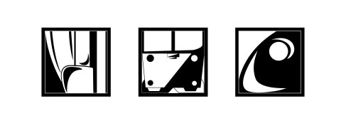
Here it is, the result of several days worth of crash courses in how to use Adobe Illustrator. Yes, I am talking about part “Bravo” of our 2nd project. I think it turned out well (though that is my opinion. Yours may vary), and much like part “Alpha”, I really do not want to mess with it any more, for exactly the reason listed last week. I know it sounds lazy, but I really do not want to mess it up, and I think trying to re-work the picture now would just make it worse, rather than better. The jpg of the finished product is shown below. Also, if you want the Adobe Illustrator file (which I could not post directly to WordPress), here is a zip file containing both the jpg and the Adobe-specific “ai” file, for use in Illustrator. I would appreciate it if you reviewed both. Enjoy.
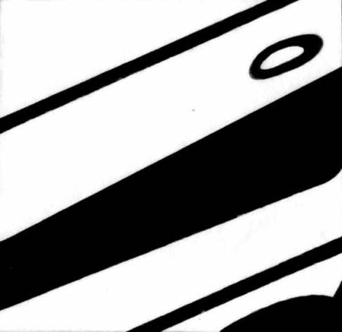
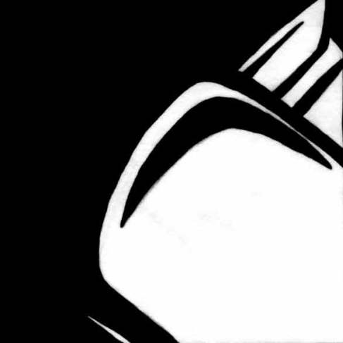
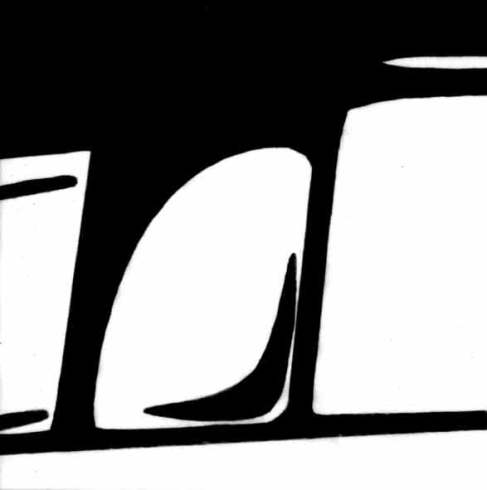
In case you are wondering, these pictures below are the original scans that I based part B on.
When I drew part A, I tried to go for variety (though balance and unity still applied), which was easier said than done, since there are only so many ways to draw a stapler, and most of my attempts at drawing it from other angles just did not turn out the way I intended. I also found that experimenting with the negative and positive space was interesting, but time consuming, and more difficult than I originally thought. The stapler was mostly non-symmetric, which was both good and bad, but allowed me to experiment with other concepts. When I started part B, I still wanted variety, though that would be a challenge because now, I was having a hard time choosing which three scans I liked most. The ones I eventually drew over (above) in illustrator were the three that, in my opinion, would give the finished product the most variations between designs. I tried to stay as true to the original scans as I possibly could, while improving them too. The lines are straighter and more precise, and the dimensions are much more even than they were before. When I had just started drawing in illustrator however, I decided to experiment yet again, but found that the designs were probably fine the way they were, so I left them that way. That was probably a good decision, since simplicity is sometimes better, though I used the experience to learn more about how to use Adobe Illustrator. Anyway this is it. I have learned much about Illustrator, and I now see how useful it really is. You can read the full story of part A in last weeks blog post. Also, if you were wondering what pictures did not make the cut, wonder no more.
They will be missed. If you would like to leave comments or constructive criticism, please do so in the comments unless you are enrolled in CAT-111, in which case, please try to leave your comments in the critique for project 2. Thank you. I look forward to seeing everyone else’s posts!
Per audacia ad astra.


Nice job on Part B (part A was excellent as well)! Your illustration has very clean lines and looks balanced. You did a fine job of focusing on specific attributes of your selected object and the results are visually interesting. Looking at your final 3 images, I would be clueless as to their origination or what part of an object they are. Really nice work on the curves (as I can attest they can be difficult to manipulate at times.